Where have all the good logos gone?
Over my career, I've witnessed all too often the agency or designer presenting a logo that 'looks nice' but, in actual fact, when dissecting the logo into its fundamental building blocks, you find that there is not much substance to it. It's a little like taking an old Beetle engine and disguising it with the body of a Ferrari. It looks nice on the outside, but when you get in to it and start the engine, it doesn't take you very far. Especially when your market is not even the 'Ferrari' type.
What I'm saying is that there are fundamental building blocks that go into making a great logo, and ultimately a great brand. One needs to address all of these building blocks and use them appropriately, relevantly and effectively to ensure you gain the most mileage from your logo.
Also, what is key to consider is that your brand tells a story without you having to say a word. And the way in which you design the logo has a subconscious impact on the viewer, hopefully pulling them towards your brand, and not leaving them unchanged or pushing them away.

The key building blocks are: Concept, colour, composition, shape, relationship, name, icon development, font choice, strapline/positioning statement, application.
We will touch on a few of these building blocks below:
Concept
A great concept is an idea that you come up with for the logo, which is relevant, appropriate and clever, giving another layer of meaning to the logo, creating intrigue that extends beyond the initial impression of the 'Design'. There are three 'types' of concept and I find that most logos fit into one of the three:
- The 'Hidden' Concept
This is when there is an underlying idea/thought behind the logo that isn't immediately obvious, but when it becomes obvious, the viewer has an 'aha' moment and 'gets it'. The logo then becomes even more powerful in their eyes.
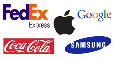
An example of this is the 'FedEx' logo. Many know of it but if perhaps you don't - the 'hidden' concept is the arrow that you see between the 'E' and 'X' of FedEx. This arrow is 'visible' due to the 'negative space' between the 'E' and the 'X'. Click here for more on hidden messages in brand logos.
- The 'Obvious' Concept
This is when a logo has an icon, either independent from the logotype or part of the logotype that can 'literally' be associated with the name of the brand. Apple is an example of this. What makes this logo even more superb is that it has a 'Hidden' concept as well. The 'Hidden' concept for this remains just that! It is still hidden. There are many speculations to the concept behind the logo, but none of these are officially confirmed. My favourite is that it was inspired by Isaac Newton's 'apple' experience when he discovered gravity.
- The 'Stylistic' ConceptThis is when there is no obvious or hidden concept but rather a 'Stylistic Treatment' of the logo that connects it with the product or service. This approach is typical in consumer brands. The example I would like to refer to is Coca-Cola. There logo has a 'fluid' treatment to it, connecting it visually with the smooth flowing beverage the world has come to enjoy. This later gave birth to what they call their 'ribbon' which has in itself become an 'icon'. This has become so powerful that they can simply use the white ribbon on red and people see 'Coca Cola'.
Colour
Colour is the most powerful building block in a logo design, in that you can have everything else right and get the colour wrong, and that will have a tremendously negative impact on the end result. The psychological impact that colour has on the viewer are too great to be ignored or to be addressed ignorantly or half heartedly.
The emotions that colour triggers in us is something to be taken advantage of when creating a brand and one can deliberately orchestrate the perception that the viewer will have of your brand through deliberate colour choice.
Composition
As with colour, composition also evokes certain feelings and dictates the perception the viewer has of your brand. For example, a flat, rectangular shape evokes a sense of stability and strength, whilst a circle evokes a sense of friendship, love and community.
In 2011, Interbrand released their list of the Top 100 Brands of the world. They made the list as the top money making companies based on their brand value. Here are some interesting facts that were released after 'The Logo Factory' analysed these brands.
- 33% of the top brand's logos use the colour blue.
- 29% of the top brand's logos use the colour red.
- 28% of the top brand's logos use black or grayscale colours.
- 13% of the top brand's logos use yellow or gold colours.
- 05% of the top brand's logos use more than two colours.
- 95% of the top brand's logos use one or two colours.
- 41% of the logos use text only (stylised type).
- 09% of the logos don't feature the company name at all.
- 93% of the logos are simple enough to be viewable in smaller sizes.
- 03% of the logos feature people in their designs.
- 67% of the logos have a more horizontal aspect ratio.
- 13% of the logos use the brand's initials in their design.
Interesting!
Credits: Design Buddy.
About Gary van Zyl
View my profile and articles...